Illustrated examples, insights and commentary exploring how advertising cards from the 1800’s provide portals through which modern collectors and researchers can better see and understand the lifestyles, values and dreams of 19th Century America.
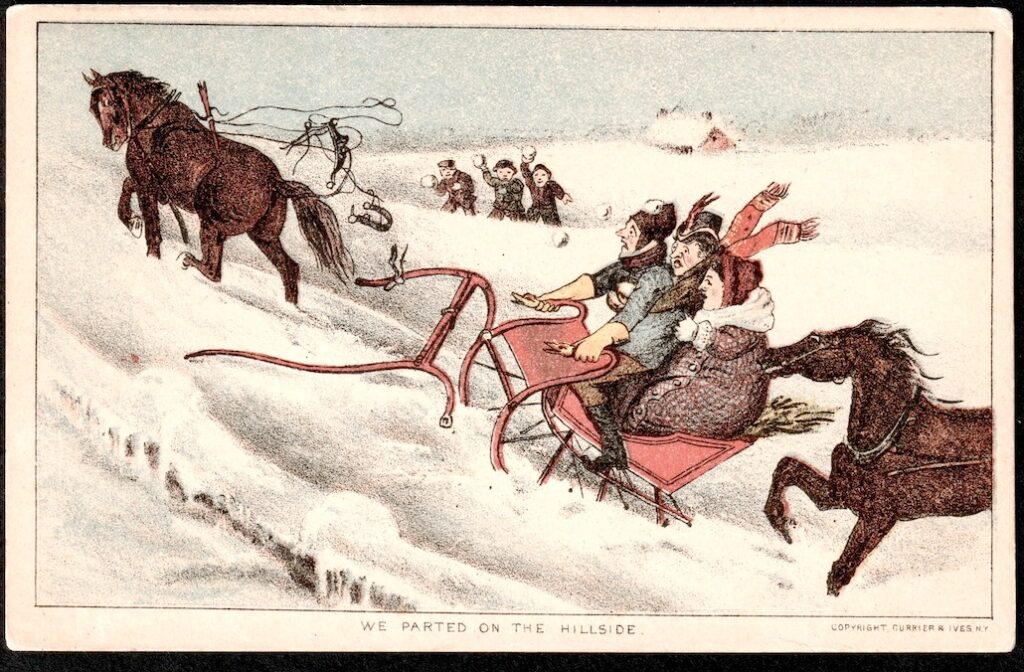
This “We Parted on the Hillside” comic image is an authentic circa 1880 Currier & Ives image as found on a trade card from the legendary Steve Rotman Collection, which I am currently selling on ebay.
While most folks are familiar with Currier & Ives as a printer of full-sized “Winter Wonderland” lithographs, it is interesting that C&I only printed a few different 5 x 3 inch Victorian Trade Cards with winter scenes. The above trade card, and a 2nd C&I card captioned “Trotters on the Snow,” are seldom available for purchase via eBay or any other venues.
A 3rd Currier and Ives winter scene card is even more RARE: “Winter Twilight” is virtually NEVER available, with only a few known examples ever making it to the Victorian Trade Card or Currier & Ives Lithographed Prints markets.
In future posts, I’ll share images of the C&I “Trotters” advertising card, as well as the rare “Winter Twilight” view trade card.
Currently, I am unaware of any place on the internet with a color image of that rare 3rd card, “Winter Twilight,” from the rare C&I group of cards identified by Ron Schieber as the
“View Titles” series.
To view Steve Rotman Currier & Ives Trade Cards currently available for purchase on ebay, please click:
Hats off to all who vote! – Patriotism, Politics, and Pumpkin Pie: the Jolly Joys… as seen in 1911.
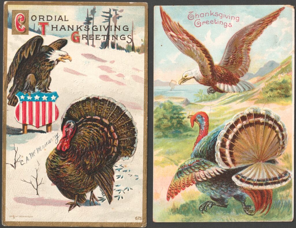
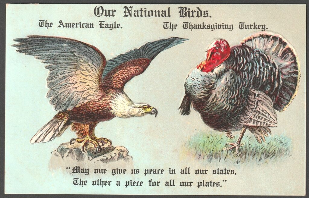
Patriotic Americans argued in the early days about which should be our National Bird:
Some voted for the Eagle… others for the Turkey.
Over the next few days, Americans will be voting again. It’s felt to me like we’ve had some similar debates in the 2024 countdown… an Eagle or a Turkey for America’s next Season of History?
I’d like to offer a brief VictorianCardHub Election Reflection on the historical showdown.
Patriotic Americans voted both ways.
Thomas Jefferson, John Adams and Benjamin Franklin began meeting already on July 4, 1776, trying to hammer out a design for an official national seal. The process of deciding took a lot of time and discussion, with Ben Franklin strongly resisting the choice of the Eagle. Eventually, Franklin was outvoted. But he complained: “For my part, I wish the eagle had not been chosen as the representative of this country.”
By next weekend, perhaps half of all voting Americans may be complaining with similar words. But hopefully our nation will get over it and move ahead with whatever choice is made.
BTW: You’ll have decide for yourself which candidate is the Eagle, and which is the Turkey 😉
Prior to the COVID Shutdown, we had a VictorianCardHub Shutdown. Actually, this Blog and website has been on bed rest for over 5 years, long before COVID 19 was in anyone’s vocabulary!
But a LOT is now happening in the world of Victorian Cards, and it’s time to revive this site and get some fun and information flowing again. We hope these posts and the VictorianCardHub site will brighten your day and cure whatever ails ya… with healthy doses of Victorian images and history to lift you up and bring you joy.
As they used to say on the empty roadside billboards:
Watch this Space
As we move into the holiday season and New Year, and then beyond, the Victorian Card Hub will be a resource and clearing house for a wide range of insights and news. You will find here links and information about everything from19th Century Social Historyto the sale if the legendary Steve Rotman Collection.
Again: Watch this Space.
FYI – – These cards celebrate that Eagle won the day… and had the Turkey for dinner.
Victorian PostCards sometimes depict the Competition between the Birds.
My VictorianCardHub Election Reflection boils down to this:
May this next Season bring all Patriotic Americans joy, and may it bring our nation prosperity and peace.
Victorian trade cards are illustrated business advertising cards from the 19th Century.
Typically printed in multiple colors, these cards were freely distributed to promote goods and services through images and text designed to be so informative, so clever, or so attractive that consumers would have a hard time throwing the ad away.
Currier & Ives dabbled in printing trade cards between 1877 and 1882. Their 12 or so series featured a range of subjects running from Sports Comics and City Views to Railroad Trains and Champion Race Horses. Most of their 200+ known card designs are of average size and quality, printed in 3 to 5 colors and cut to about 5 inches in width, slightly smaller than a modern postcard.
The Rise of 19th Century Advertising Cards
The “Golden Years” for American advertising trade cards began with their explosion in popularity as free exhibit souvenirs from vendors at the 1876 Centennial Exposition in Philadelphia. The Golden Years for Victorian trade cards ended around 1901.
In 1876, the American Industrial Revolution was hitting full steam. Innovators and manufactures were developing new products, and they were eager to showcase their goods and explain the benefits of their brands in the most spectacular and memorable ways possible.
Full-color Victorian trade cards fit the bill perfectly.
In an age dominated by stark black and white photography and one-ink letter presses, the rainbows of colors and extravagances in chromolithographed images made Victorian trade cards an instant hit.
Most of the early cards were produced by well-established lithographers in Philadelphia, Boston, and New York, but as the popularity of Victorian trade cards mushroomed, other printers began setting up color presses and producing them in virtually every major city in America.
By the time of the 1893 Chicago World’s Fair and Columbian Exposition, a business could hardly be considered respectable if it was not issuing cards worthy of a collector’s album.
Exhibitors at major fairs and expositions often provided free souvenir cards for those who visited their booths. These cards typically featured proud and patriotic images, as well as depictions of fairground buildings linked to the marvels of the products being promoted. This 1893 Columbian Exposition card is unusual in that it is an example of early off-set printing; most Victorian trade cards were printed as lithographs.
Major lithographers like Ottmann of New York landed the biggest printing contracts with national firms like Hires Root Beer and the Singer Sewing Machine Company, who placed orders of hundreds of thousands of cards at at time.
But there was plenty of business for everyone, large or small.
In remote villages, print shops joined the action by customizing cards to their handful of stores on Main Street. These shops would purchase thousands of assorted color “stock cards” from the big cities. Stock cards arrived in bulk with blank areas for the imprinting local business names and addresses, as well as any requested advertising text that could fit in the remaining space.
Stock cards could be imprinted one-by-one using inexpensive card presses which were sold mail order for just such purposes. In small town press rooms, or even in the basement of a dry goods store, a store name and address could be applied by means of a rubber stamp.
A female sales representative for TRIX “Breath Perfume” distributes free advertising cards during a sidewalk stroll. Cards distributed in this manner sometimes have messages on the back, such as: “Children, be sure to show this card to your mother, and don’t forget to….”
By the 1880’s, collecting Victorian trade cards had become a national craze.
Articles were written about the proper way to trim the margins off advertising cards so the distraction of white borders would be eliminated when a card was pasted into a scrapbook.
Discussions were held on the merits of mounting cards with flour pastes rather than with leather glues. Etiquette essays were written to instruct refined young women how to cluster their cards in themes, as well as how to select certain types of albums to reflect the highest possible level of sophistication. Children competed with neighbors to see who could fill the most parlor albums the quickest, but parents got in on the fad as well.
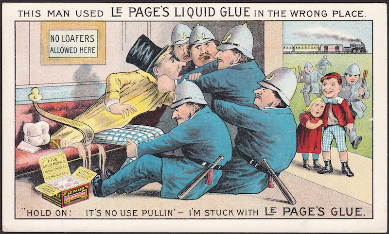
Numerous versions of this classic Chase’s Liquid Glue ad can be found, ranging widely in quality depending upon which lithographer printed the card, and how much this Boston company was willing to pay for that particular press run. This example is on the low end of quality, with an almost comic book style of coloration. Compare the faces in this image with the quality of facial tones on the National Yeast Co. card at the top of this blog. BTW, NOTE the text: “…will hold fancy cards in scrap books without wrinkling….”
Mothers would help the wee ones with their collecting, and in many cases, the scrapbook became as much the mother’s project as anyone’s.
Men began seriously collecting cards in the 1880’s when tobacco companies started issuing sports cards, joke cards, and actress cards with men in mind.
(Tobacco insert cards evolved into a genre of their own. More on that in a future blog.)
How Victorian Trade Cards were distributed:
Victorian trade cards were often placed in stacks on store counters, free for the taking.
Other times they were passed out by salespeople on the sidewalk.
They could even be found packaged as “prizes” inside coffee tins or boxes of soap.
Examples from this “Card Fiends” series can be found with imprints from locations all over North America. The female shopper in this example has filled her arms with Victorian trade cards, advertising card die-cuts, and card novelties from every store in town. This example is imprinted for a hardware store in South English, Iowa… a town today with a few over 200 souls.
To exploit increasing demand, book stores started buying batches of cards to sell to collectors.
Collectors began writing to companies for free samples, or even sending money directly to printers to purchase large assortments of cards before (or sometimes after) the ads were applied.
The prospect of free cards lured many consumers into stores and purchases they might otherwise have skipped. This Victorian trade card promises: “4 Chromo Cards Given Away to Each Customer….” It was left to the shopkeeper and the guest to haggle out the definition of “Customer,” and whether a purchase was required for them to receive their free Victorian trade cards.
By the mid-1880’s, Victorian trade cards were being distributed and collected from coast to coast, from affluent urban centers to rural farm villages and remote mountain mining camps.
The reverse of this stock card was boldly imprinted with the plea: “STOP… Read This Before You Take Another Step.” The rest of the text promoted a clothing sale, then concluded with the business information: “J.A. Godrey & Co., Clothiers & Haters, 46 Bank St., Waterbury, Conn.”
The Fall of Victorian Trade Cards
The prestige of trade cards tapered off dramatically after the Buffalo, New York, Pan-American Exposition World’s Fair of 1901.
By the arrival of the 1900’s, colorful magazine ads were on the rise, and the new fad of collecting postcards was taking the nation by storm. For the “modern” young people of the new century, assembling and organizing hand-addressed postal cards was all the rage. Filing and shuffling their exotic treasures in the slotted black pages of post card albums made gluing Victorian trade cards seem messy, and more like something “old-fashioned” only their mothers would do.
Queen Victoria ruled the UK from 1837 until she died of old age in 1901.
It seems fitting that as the Victorian era passed away and made room for the innovations of the 20th century, so, too, did Victorian trade cards fade away and yield their preeminence to modern advertising and the new cards that became in many ways the equivalent of Twitter and Selfies today.
But more on the transition from trade cards to postcards will be covered in a future blog.
For an in-depth expanded version of this blog,
click the article link below:
Again, as always, all the BEST to you… and Good Collecting! — Dave Cheadle
Especially the kind of tale that delivers a happy ending.
Advertisers know this, so their most effective ads often tell the story of a good experience, a difficult life that is upgraded and improved through the purchase of a specific product and brand.
According to many Before and After trade card tales, a consumer (like the above “Senator Jones”) can be literally transformed from a state of frowns and frustrations to a place of bliss and grins… merely by purchasing the correct item.The “Problem to be Solved” in this picnic narrative was the fuss and bother of having to build and tend a wood fire for a hot drink. The solution, of course, was found through the purchase of a clean and modern new Florence oil stove.
During the 19th Century, it was hard to get any more dramatic and obvious in storytelling about improvements in a consumer’s life than can be found in what collectors now refer to as: “The Before and After Trade Card.”
The Before and After Trade Card Book by Ben Crane
For the story of cards telling tales of consumer breakthroughs and transformations –and for an illustrated review of many classic examples of these ads– the best resource is Ben Crane’s 1995 book:
Crane’s study includes thoughtful discussions and helpful illustrations of Metamorphic and folding trade cards, “See-Through” Hold-to-Light cards (HTL), Turnover cards, Optical Illusion cards, Heat Sensitive cards, Then and Now, and others.
Over 80 metamorphic trade cards are shown (both opened and closed) in Ben Crane’s essential 19th Century Victorian Advertising Trade Card Resource.
Numerous other types of “problem solved” cards are shown as well.
The makers of Buckingham’s Whisker Dye used the folding flap on this card to suggest the magical transformation a white-bearded “BEFORE” gentleman into an improved youthful version through the application of the bottled product shown on the “AFTER” shelf.
With and Without cards, Paneled (and unpaneled) cards, Moving and Mechanical cards, Upside-Down cards (ambigrams), and even Before, During and After cards showing a progression of changes are all illustrated and discussed in Ben’s book.
This Buckingham Whisker Dye card illustrates a gradual transition over the course of use, from BEFORE to DURING, and then eventually arriving at the desired final AFTER state.
Some of the transformations illustrated in these cards seem odd by today’s standards.
For example, in Victorian times, being “large” was often a sign of prosperity and good eating.
From skinny to rotund in 4 weeks, thanks to the fine dining rooms at the Mercantile Hotel.
Philadelphia’s Mercantile Hotel catered to 1876 Centennial guests, but they also stayed around long enough after the exposition to develop a regular local clientele who could buy “First Class Meals” for 25 cents. To suggest the quality and quantity of their meals, they issued a card showing a very thin man growing fat on their fare in a single month.
Before and After cards offer some of the most fascinating views of Victorian life and fantasies imaginable. No wonder these clever and promising 19th Century ads were so popular in their day.
And no wonder they remain so popular yet today.
Ben Crane was a founding member of the Trade Card Collectors Association, and he contributed an outstanding overview article to the TCCA’s very first journal, ATCQ, Spring, 1994.
A reprint of Ben’s article can be found via the above link.
For more about Ben, and to tap into the wonderful resources of his huge website, click on:
More examples and discussions of the 19th Century Before and After Trade Card will be shared in future Victorian Card Hub blogs, but the link to Ben’s ATCQ article will provide researchers and collectors a very good introduction to these types and styles of storytelling cards.
Again, Ben’s article can be found in the Victorian Card Hub archive.
Victorian trade cards were often beautiful, clever, and informative
19th Century consumers gathered these irresistible advertising give-aways from wherever they could find them. And those original Victorian collectors treasured their specimens of 19th Century printing and lithography for good reason.
In an age of mostly black and white photography and line-art publishing, lithographed cards came in breathtakingly vibrant colors.
Advertising cards were informative, and not just about the latest innovations of the industrial age. In addition to educating about new products, these cards incidentally informed about popular culture, teaching people in different regions about new trends and fads from across the country, if not from around the world.
Yes, they were far too fascinating and beautiful to throw away. And even the blandest of these advertising cards were often clever, if not laugh-out-loud comical.
But, oh… the color ones!
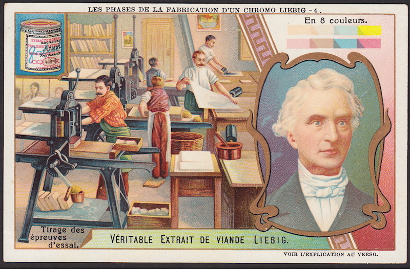
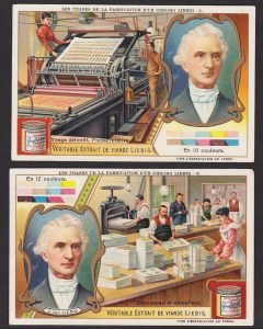
Artists at work in a lithographic printing shop, as depicted on a Liebig card from the Turn-of-the-Century. The portrait on the left shows a face after six passes through the presses, with a different color of ink layered onto the card by a different stone during each pass.
Young and old Victorians alike gathered these cards from wherever they could find them: store counters, sales representatives, even packaged inside coffee tins and soap wrappers. Card collections were then sorted, traded with friends, pasted into scrapbooks… even pinned up on the wall or tucked into mirrors and picture frames around the home.
At times, it got competitive, with collectors racing to see who could fill the most albums with the best cards in the shortest amount of time.
In fact, some 19th Century collectors were so aggressive in their collecting they were at times described as down-right “fiendish” in their enthusiasms.
“The Old Gent Fiend” as depicted in a “CARD FIENDS” set of cards showing men, women, boys and girls all trying to collect more than their fair share of the freebies.
With so much 19th century fascination and energy invested in collecting cards, it is not surprising that a few cards were printed… about cards being printed.
And because a picture is worth a thousand words, let’s see it:
19th Century printing and lithography
as explained and illustrated by cards
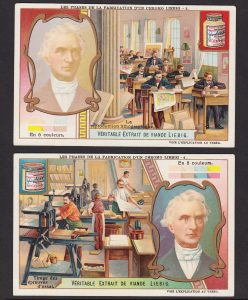
Card number one in the Liebig set depicts an artist composing a card design as a watercolor painting. The second card in the set shows the limestone slabs being harvested from a quarry and cut to sizes for the stone press operations.
Liebig issued an amazing 6-card set illustrating each of the phases involved in producing a 12-color lithographed card. As chromolithography is explained in these card pictures and captions… the depth of color begins to emerge as inks are applied to Liebig’s portrait!
Of course, some trade cards were inked in as few as one or two colors, and on the other end of the spectrum, Prang Lith. of Boston was known to have inked some prints in 20 colors or more. But this Liebig set illustrates the process very well.
The scenes and captions of the six cards are as follows:
1. The Artist Composes the Subject
/ Portrait – in 2 Colors (L’artiste composent le sujet.) 2. Extraction of the Lithographic Stones
/ Portrait – in 4 Colors (Extraction des pierres lithographiques.) 3. Lithographic Reproduction
/ Portrait – in 6 Colors (La reproduction lithographique.) 4. Creating the Proofs
/ Portrait – in 8 Colors (Tirage des epreuves d’essal.) 5. Final Run. Rotary Press
/ Portrait – in 10 Colors (Tirage definitif. Presse rotative.) 6. Cutting and Packing
/ Portrait – in 12 Colors (Decoupage et emballage.)
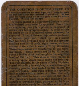
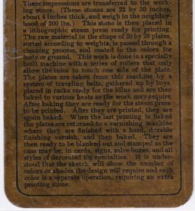
Before examining the remaining four of the Liebig cards, it might be helpful to read what one American firm said about the process of color printing.
The production of lithographs was explained in detail on a card issued by
Burdick & Son, lithographers and manufacturers of metal and tin work, Albany, NY.
This Burdick & Son factory view card advertises their ability to produce “Decorated” tin boxes and tin signs. The reverse of this metal card explains the process of printing lithographs on tin.
Burdick was noted for, among other things, manufacturing custom tin boxes with beautifully lithographed images. One of the cards they distributed at expositions features a factory view of their Albany, New York, facility. This card is itself a showcase of their work: the card is composed of tin, rather than cardboard.
It is a card designed to demonstrate to potential clients the quality of the 19th Century printing and lithography work they could expect when placing orders for “Decorated Tin Boxes” and lithographed signs, etc.
The reverse of the tin Burdick card answers the Question: “How do you decorate the Tin Boxes, Signs, etc.” The card’s text goes on to explain the chromolithograph printing process in helpful detail.
The metal Burdick card describes on back the work that is done with the lithographic stones, the inking process, and other aspects of 19th Century printing and lithography image production.
Back to the Liebig set, which illustrates these steps in 19th Century printing and lithography in brilliant color stages:
Card 4 of the Liebig set shows printers working with their prepared stone slabs.
Note vertical rows of the stones beneath the presses, with additional stones lined up on distant shelves.
By the final two cards of the Liebig set, the portrait of the company’s founder grows rich and realistic in subtle hues. By the time of the application of the 12th color of ink, the skin is lifelike indeed.
Only one color of ink is applied at each pass through the press, so to get the final portrait image, this card was imprinted 12 times!
And again, each imprint required a distinct stone.
More information about 19th Century printing and lithography will be shared in future posts, but this should give folks a pretty good overview.
A permanent (and expanded) version of this blog post will be posted into the Victorian Card Hub archive.
More about Patent Medicine Cards on History Channel:
Pawn Stars, Monday Night, April 23, 2018
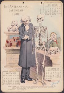
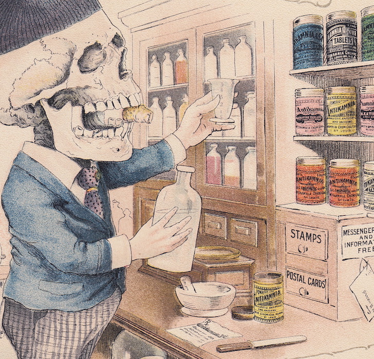
People have been asking about these fabulous “Dark Humor” Antikamnia calendar cards.
Some are actually hilarious or even cute, while others are definitely creepy.
For more “background information,” read the reverse note from the last card they issued:
“Dear Doctor… As a Souvenir if the Holiday Season we present you with our 1901 Antikamnia Calendar, another, and the last of the now famous “Skeleton Sketches,” the original water-colors of which were painted by the late Louis Crusius, A.M., M.D….”
The Antikamnia Chemical Company hired local physician-artist Louis Crucius to do the art for the calendars. Crucius was also a pharmacist, and did the “Skeleton Sketches” drawings while working at a pharmacy. Five years worth of the calendars – 1897, 1898, 1899, 1900, and 1901 – were printed.
Antikamnia’s analgesic compound, which was never patented, was marketed as a ‘proudly ethical drug’ and used to treat headaches, fever, stomach aches, nervousness, insomnia and ‘the blues’.
They claimed their cure was a new synthetic coal-tar derivative, but it contained almost 50% acetanilid, which they mixed with codeine or quinine. Or even Heroin!
The toxic effects of acetanilid were exposed in a 1907 California State Journal of Medicine article, ‘Poisoning by Antikamnia’, and the company was prosecuted by the government in 1914 for violating the disclosure terms of the Food and Drug Act of 1906.
Turn-of-the-Century med student slumps in class as his professor asks him about a victim’s deadly wounds… and this poor skeleton’s demise.
Skulls, Headache Pains,
Acetanilid… and Tylenol
Nobel Prize-winning biochemist Julius Axelrod discovered that the primary metabolic product of acetanlilide is a compound called paracetamol.
Of course, you may know paracetamol by its other chemical name, para-acetylaminophenol … or Tylenol.
To learn more via national television, watch the Season 15 Episode 25 History Channel show about Antikamnia skeleton calendar on Pawn Stars, April 23.
All the BEST to you, and as always, Good Collecting! — Dave Cheadle
Growing up on a farm in rural western Michigan, I used to go around digging bottles from old country dumps.
With a little scrubbing, those “dump” bottles sparkled up pretty nice, and I started seriously collecting medicine bottles for the shelves and window sills around our 1800’s farm house.
There were six of us kids living under one roof, and eventually my little brother and youngest sister started coming along to assist with a shovel, and then to help with the washing when we got home (for a nickle per bottle). Even my dad got pulled in, and after a hard day he’d sometimes join in a local dig.
Mom, not so much. But she liked them in the window just fine.
As my collection grew, I started selling duplicates at flea markets… then setting up sales tables at antique shows and bottle swaps around the Midwest.
From antique bottles, I transitioned into collecting patent medicine advertising of the sort featured at the top of this blog post. I found the added information on these ads to be very helpful when I was giving a sales pitch and trying to make a bottle sale.
And then I started really falling in love with the cards, signs and almanacs themselves.
From Glass to Paper
Over time, my collection of 19th century patent medicine advertising items expanded into other areas such as pre-prohibition beer and whiskey cards, soap ads, and agricultural farm equipment folders.
By the time I was teaching high school History and English in my 20’s, I was collecting Victorian lithographed cards of everything from men’s top hats to State Fair horse races.
Pre-Prohibtion beer, wine and liquor advertising cards are very popular among collectors. Antique bottle collectors compete with card collectors and local historians, all of whom have their reasons for wanting good examples of these often wonderful cards.
In the 1980’s I began selling illustrated articles to magazines like Bottles & Extras and Sports Collectors Digest. I would specifically look for Victorian Advertising Trade Cards to illustrate the specific themes I was researching and writing about, feeling like I could justify buying whatever I needed for the sake of “historical preservation” … and I rationalized that my published documentation of these artifacts would serve as a valuable legacy to future generations.
This sounded pretty convincing to me, but my wife didn’t always see it that way 😉
By the 1990’s when the trade card collecting hobby was really taking off, I had published dozens of articles in everything from Victorian Decorating and Lifestyle to a cowboy history magazine.
That’s when Russ Mascieri reached out to me to join him in launching a new collectors’ association for card folks. Russ was the proprietor of the hugely successful Victorian Images trade card auctions, and he figured together we could put out a journal to serve the card collecting community. More on that another time, but we had a good run, and we saw the hobby flourish during those years.
After the Trade Card Collectors Association closed down in 2002, I shifted my focus somewhat away from writing about cards and social history, and more towards selling my duplicates on ebay.
My kids were growing up, and I had to pay some bills.
Dave Cheadle making his pitch to Pawn Stars celebrity Rick Harrison. The episode with Dave offering Rick a complete Antikamnia calendar airs on April 23: Season 15, Episode 25.
From Paper to the Web
… and to Television
Fast forward to April, 2018.
The bug to write again about cards, and to try to bring the card collecting community together again, motivated me to search for some sort of cost-effective way to get things rolling.
Everybody kept telling me I should write a blog.
A busy blog starts showing up on search engines, and traffic increases. Linked to a website, this venue might get some traction.
By April 15th, we’d launched the framework for the Victorian Card HUB, and folks started signing up to subscribe to the blog and newsletter. The new HUB website was getting hits, but far fewer subscribers than I’d hoped.
And the first newsletter experiment was still in the works, but I could not find an angle.
Suddenly, I discovered that I’d be appearing on Pawn Stars the next week.
Back in October, I’d filmed a couple episodes with Rick in Las Vegas, and in one of those shows I’d given him a chance to purchase one of my complete Antikamnia skeleton calendars.
I’ve not yet seen the episode, but it was pretty interesting to film. I have no idea how the show will be edited, but Rick and I got around to shooting the breeze about Victorian lithographs, and about patent medicines, and a bit about Victorian culture and history.
Those are three of my running passions… and perhaps yours as well?
Hence, this story… and our first HUB newsletter and mailing!
Skeletons appear in a good number of advertising trade card images, but sometimes only incidentally, as in this schoolroom scene issued for Enterprise Manufacturing in the 1800’s. Note how the teacher conducts a Q and A with the young ladies of the class, confirming them in their consumer knowledge of the merits of Mrs. Potts’ Sad Irons.
I’m not quite as egotistical as this blog might seem from all of my rambling about myself and the show on April 23.
But I AM looking for a way to generate more steam for the HUB.
For the HUB to flourish, we need hundreds more folks to visit the site. To bookmark the HOME page. And to subscribe to the blog newsletters.
Lots of folks watch Pawn Stars. Millions of them, from what I hear. (I don’t get cable, so I have to go to a buddy’s house to watch the History Channel.) Anyway, I’m hoping to leverage the upcoming show. Maybe you’d be willing to help?
Please feel free to forward this email to as many folks as you think might get a kick out seeing some really cool ephemera on national television. Tell them how you collect old cards like this, and that you’re not crazy… this stuff can actually be VALUABLE and HISTORICALLY IMPORTANT !
Brag a little… and tell them about one of your really cool cards.
Tell them that Antikamnia wasn’t the only patent medicine firm to issue skeleton cards. Let them know there are a handful of other “creepy” cards in the genre, including this classic:
Hunt’s Remedy Trade Card: Not a “rare” card, but pretty hard to come by because of the huge demand. This classic card depicts a man using a cure bottle to beat back the Grim Reaper. This Death Skeleton image was adapted by Dick Sheaff (a design artist and a trade card collector himself) for a United States postage stamp. More on that another time.
Did I mention that you could use the April 23rd Pawn Stars show as an opportunity to brag about
one of YOUR favorite cards?
NOTE: if you or any of your interested family or friends miss the premier of the Antikamnia card episode, you can probably catch a rerun later in May. The History Channel often runs their “new” episodes a few more times during the next 30 days after a premier. Plus, most folks can figure out how to pull an older episode up ON DEMAND, or by using their computer. My episode is S15, E25, the one titled: “Highly Explosive Pawns.”
I’m the guy at some point in the episode who makes Rick feel “dated” when I show him crazy skeleton images from the chemical company’s advertising calendar pages.
Rick Harrison is the shop owner and marketing genius behind the History Channel’s most popular show, Pawn Stars. On Monday, April 23, Rick will handle and discuss the purchase of a Victorian piece of great interest to most advertising trade card collectors. The episode is called: “Highly Explosive Pawn.” Watch for the segment on the Creepy Chemical Company Calendar.
THANKS again for
Subscribing to the HUB
… and please invite others!
Classic Antikamnia Skeleton Calendar Card from the same series Dave Cheadle offers to Rick Harrison on Pawn Stars.
The above image comes from the same series as the Antikamnia skeleton calendar on Pawn Stars.
Okay. I really appreciate you help on getting out the word.
All the BEST to you, and Good Collecting! — Dave Cheadle
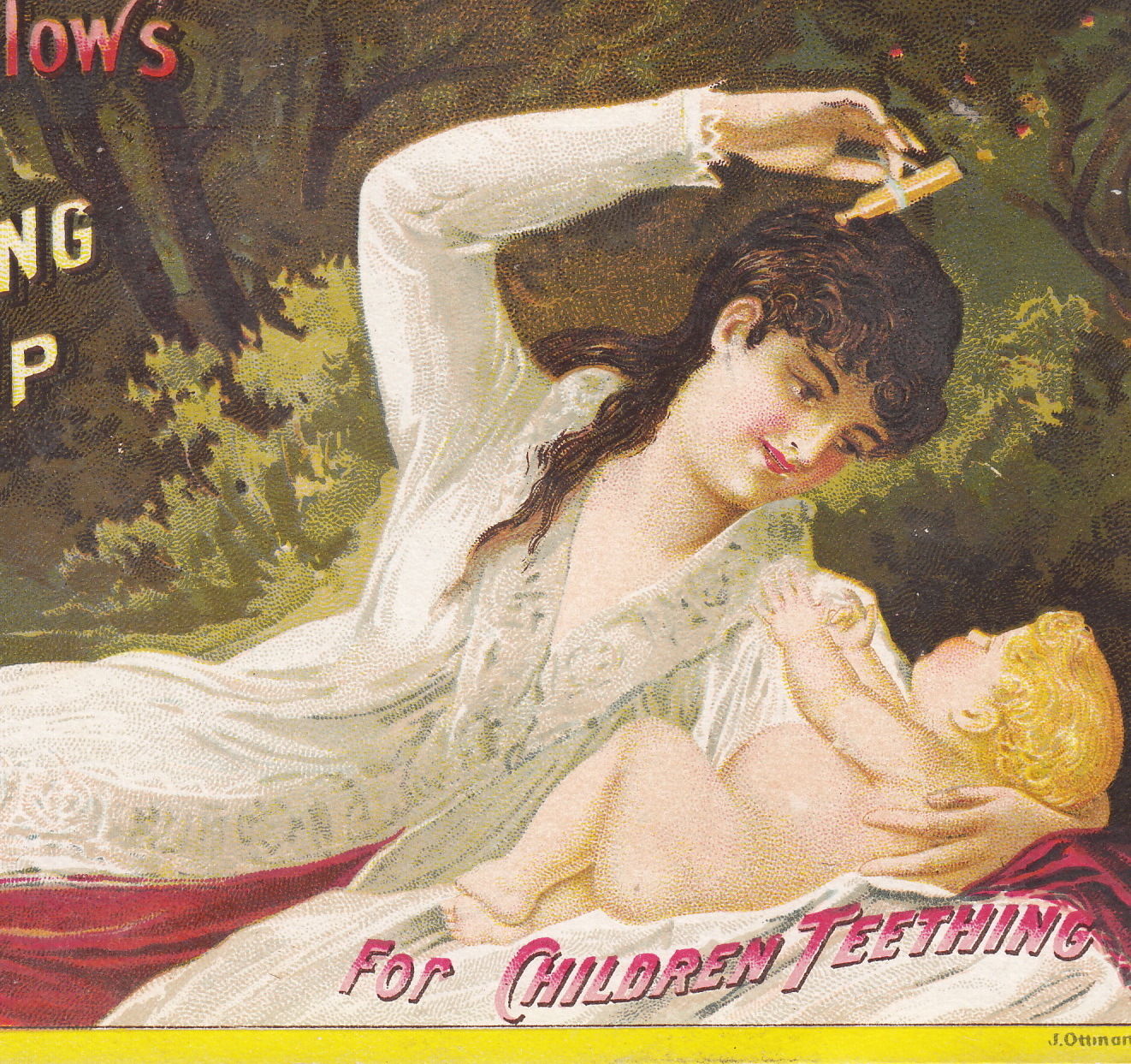
Mrs. Winslow’s Soothing Syrup was a Victorian-era patent medicine guaranteed to quiet a crying infant. The problem, of course, came when the morphine of the deadly teething syrup wore off. As the baby stirred from a deep slumber, the infant would inevitably wail for another dose… if the baby ever woke at all!
Whether administered by a mother, sister, housekeeper, or Mary Poppins herself, Victorian babies stopped screaming after a dose of Mrs. Winslow’s pain killer. Like many bottled cures of the day, the Winslow’s Syrup label failed to mention the magic of the remedy was found in the addictive drugs it contained.
Deadly Morphine-Laced Tooth Cure
According to A. Walker Bingham’s 1994 book, The Snake-Oil Syndrome, Mrs. Winslow’s was just one of many baby medicines that contained potentially lethal ingredients. Among other top selling “family medicines” of the late 1800’s were James’ Soothing Syrup, Seth Arnold’s Cough Killer, Dr. Bull’s Cough Syrup, Ayer’s Cherry Pectoral, and Dr. King’s New Discovery, all of which contained alcohol and morphine, opium, or heroin.
But on account of massive marketing campaigns and the millions of bottles they sold, Mrs. Winslow’s remains one of the most infamous of the “baby killer” bunch.
According to Wikipedia, Mrs. Winslow’s Soothing Syrup was a medicinal product formula supposedly compounded by Mrs. Charlotte N. Winslow, and first marketed by her son-in-law Jeremiah Curtis and Benjamin A. Perkins in Bangor, Maine, USA in 1849.
The formula consisted of morphine sulphate (65 mg per fluid ounce), sodium carbonate, spirits foeniculi, and aqua ammonia.
It was claimed that it was “likely to sooth any human or animal”, and it promised to effectively quieted restless infants and small children, especially when they were teething.
In addition to morphine, Mrs. Winslow’s Soothing Syrup contained plenty of alcohol, so it’s not surprising that the syrup put infants to sleep. The additional claim that the syrup would cure diarrhea was also true, because one of the common side effects of opioids is constipation.
In 1911, the American Medical Association put out a publication called Nostrums And Quackery where, in a section called “Baby Killers,” it specifically called out Mrs. Winslow’s Soothing Syrup.
Dr. Winchell’s Teething Syrup, like Winslow’s, contained enough morphine to quiet even the loudest of wails.
Deadly Teething Syrup “Baby Killers”
Like the Winslow cure, the popular Dr. Winchell’s Teething Syrup remedy contained morphine, and it was also specifically targeted to households seeking a reprieve from a crying child. But while the beautiful full-color Mrs. Winslow’s advertising cards show the bliss of a child at peace in a radiant mother’s arms, the classic Dr. Winchell card depicts in subdued and forlorn hues a pathetic papa “before” he discovers the miraculous transformations possible with the good doctor’s drug.
Dr. Winchell also issued a few cards which, ironically, go to great lengths to claim on the reverse:
“TAKE NOTICE… contains no opium, and no ingredient that can harm the most delicate child.”
Laboratory analysis proved otherwise, and Dr. W’s remedy (which promised to “absolutely cure every case”) was another dangerously potent product targeted by the Pure Food and Drug Act of 1906.
The reverse sides of the Winslow “Baby Killer” cards carried 1880’s Calendars so the parents would hang onto the advertising. Also printed on back was: “Advice to Mothers… Mrs. Winslow’s Soothing Syrup should always be used for Children Teething. It Soothes the Child, Softens the Gums, Allays all Pain, Cures Wind Colic, and is the Best Remedy for Diarrhoea.”
One of the schemes of 19th Century advertising was to trick consumers into keeping the free cards they received at drugstores for the sake of the handy pocket-sized calendars printed on the reverse. During the late 1880’s, Winslow issued a series of four such cards, plus several variants and mid-year editions. Many of these cards offer the following:
“ADVICE TO MOTHERS. Mrs. Winslow’s Soothing Syrup should always be used for Children Teething.”
And why not? It certainly worked.
Nobody could deny the ensuing quiet after only a few drops.
Well, as it turns out, America had a whole generation of babies struggling with the pain and damage and trauma of withdrawal, thanks to this deadly teething syrup.
It is uncertain how many children actually died from these syrups, but the number is estimated to be in at least the thousands. Many doctors, let alone parents, were ignorant of the unlabeled contents of popular medicines, and the effects of many of these strong drug combinations were still being researched, documented and challenged by industry powerhouses like Mrs. Winslow’s.
So we’ll never know the toll and damage for sure.
In this card image, a Victorian mother snuggles with two children in bed. Together, she and her oldest examine the paper, which carries a full page illustrated ad for Mrs. Winslow’s cure. The teething child tucked within her right arm appears dreamy eyed, perhaps because of mother’s soft comfort, or perhaps from the morphine and alcohol from the open bottle on the night table.
The classic Mrs. Winslow’s deadly teething syrup bottle is a 5 inch cylinder shape, and depictions of the bottle and wrapper appear in their Victorian trade card ads. Bottles in others sizes can also be found, as well as examples with embossing variations from the UK and other parts of the world.
Lovely Victorian Baby Bassinet with bottle of Mrs. Winslow’s Syrup on the table.
The Romanticized Victorian Vision
Future blogs will explore this in much more depth, but in passing, I’d be remiss if I failed to mention the treatment of women and motherhood in the Mrs. Winslow ads.
By the 1880’s, the Winslow patent medicine empire was powerful and far reaching, and they could afford to employ some of the best marketing people of the day.
They issued recipe books, store signs, newspaper ads in almost every city, and even colorful hand-held advertising fans. But their most beautiful and enchanting work was reserved for their Victorian trade cards.
In these idealized visions of the “Good Life” in American, we observe healthy, well-dressed women enjoying the privileges of leisure and wealth. For many American women, the days were long and hard, if not dusty and brutal. The romanticized images presented by Mrs. Winslow’s Syrup held up glimpses of what many hard-working women and impoverished mothers aspired to attain, but few would ever realize.
Bottles of deadly teething syrup were sold by the millions, partly because of these cards.
If the exhausted mothers of the 1800’s could not actually live the lives depicted in these ads, perhaps they could quite their crying infants for a few hours of rest… and dream.
Check back for future blogs on Patent Medicine Advertising and 19th Century Visions of the “Good Life,” as well as many other fascinating Victorian Card topics and visual themes!
Bigotry and Ethnic Stereotyping in 19th Century Advertising Card Images
Racist attitudes flourished in the 1880’s, and they were backed by some of the “best” so-called science of the day.
Fueled by Darwin’s theories and naive “new insights” from studies in fields like anthropology and phrenology, some of the most educated Victorian-era elites were among the period’s biggest bigots, and “scientific racism” flourished.
Of course, one didn’t have to be a 19th Century intellectual to be a racist.
The “sport” of racism was open to all.
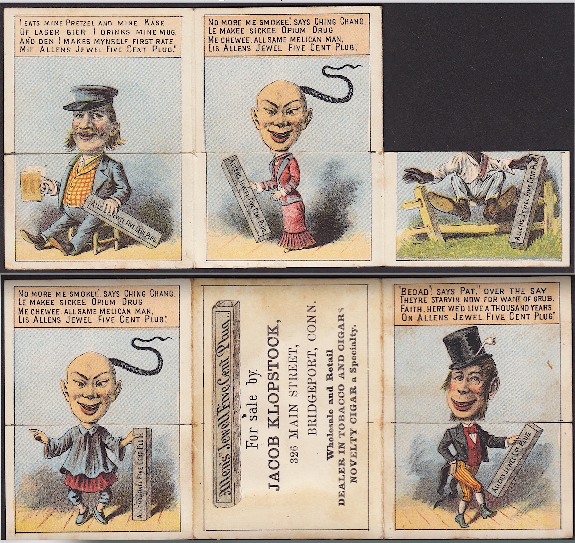
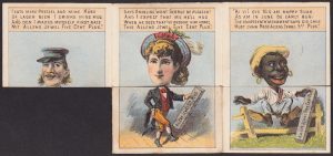
Negative Chinese Stereotyping: “‘No more me smokee,’ says Ching Chang. / ‘Le makee sickee OPIUM DRUG / Me chewee, all same Melican Man / Lis Allens Jewel Five Cent Plug.'”
Chinese and African-American Blacks
Negative stereotypes of numerous people groups appear in hundreds of Victorian Advertising Trade Card images. In future articles and blogs, we’ll explore more examples of racial profiling in advertising, and the way many ad cards depict Japanese people, as well as Native American Indians, and immigrants of French, Jewish, Arab, and Spanish heritage.
But in this blog, I will launch into the subject of 19th Century racial profiling in advertising via a close look at one particularly representative –and reprehensible– example of ethnic stereotyping as found on a card issued for “Allen’s Jewell Five Cent Plug Tobacco.”
Note this derogatory poem by a “Happy-go-lucky” African-American: ‘Ki yi! Dis Nig am happy suah, / As am in June de early bug: / The Fourteenth ‘mendment says dis Chile / Mus chaw Mass’ Allens Jewl 5ct Plug.'”
Racial Profiling in Advertising:
Allen’s Jewel Plug Tobacco
This “Allen’s Plug” 19th Century Tobacco Card is of the novelty type known as a “Metamorphic.”
Most metamorphic cards have one flap the folds either up or down (or left to right) in order to change the scene and tell an often humorous story of transformation — typically from a state of misery to a place of joy after finding the correct product to improve the character’s situation.
With this circa 1880’s card, we find four double-sided flaps designed to create multiple “mix and match” ethnic and gender absurdities. Poems, written in the supposed “dialect” of each group being ridiculed, accompany each head shot. Additionally, the stereotyped “flaws” of each group are elevated in the spirit of classic Victorian “humor.”
For “Ching Chang,” the laborer from China, Allen’s tobacco offers an upgrade from opium, as well as an opportunity for the man to become “all same melican man” — the same as an American man.
For the former slave from the South, “Dis Nig” is now happy, sir. Why? Because “Dis Chile” thinks the Fourteenth Amendment says he must chew “Master Allen’s” nickle plug tobacco. And he likes it!
When fully open, this metamorphic tobacco card places a Chinese man on the far end away from the fellow from Ireland, but the card can be folded in a way to bring the two characters together into an absurd mash.
Irish Jig Dancing Nonsense
Heels up and clay pipe firmly tucked into his hat, the monkey-faced Irishman of this metamorphic tale grins and dances a jig; in his sly simian way, he declares the Irish famine to finally be over… thanks to affordable tobacco.
And then, if you manipulate the racist flap images a certain way, you can bring the nonsense of the Irish dancer and the aspirations of the Chinese laborer into a composite new monstrosity. Their merger becomes a bigot’s dream come true… a “comical” figure not to be taken seriously at all.
Victorian cards often depict Irish men with “monkey features,” suggesting that — on Darwin’s scale — the tribes of the Emerald Isle are closer to apes than their English cousins from London.
In the pseudo-scientific literature of the 1800’s, the “ape-like” Celt took a beating. For example, Charles Kingsley wrote that he was “haunted by the human chimpanzees” he saw in Ireland, and that “to see white chimpanzees is dreadful; if they were black, one would not feel it so much. . . .” (see: L.P. Curtis, Anglo-Saxons and Celts: A Study of Anti-Irish Prejudice in Victorian England, 1968, 84).
The mean-spirited edge found in most of the cards that are guilty of racial profiling in advertising is usually directed at African-American Blacks and impoverished Chinese and Irish laborers.
The stereotypes are greatly softened in nearly all representations of German-Dutch immigrants.
The worst that can be said of these Beer-Drinking and Pretzel-Munching jolly good fellows is that by-and-large, they’re overweight.
Then again, in the 1800’s, a man’s thick waist was viewed as a proof of intelligence and industry, and both were admired traits guaranteed to produce the rewards prosperity… with endless good eating.
The flourishing German enjoys “mine pretzel” and “lager beer.” And then he “makes mynself First Rate” using Allen’s tobacco. Meanwhile, the fair Angeline says of her husband George: “I expect he’ll hug / When he sees that I’ve brought him home / This Allen’s Jewel Five Cent Plug.”
A “Tip of the Hat” to Gender Roles
The final panel of this card depicts a Victorian beauty, classically adorned in her corset and bustle, topped with an elaborate hat. Trim and radiant, the angelic blonde “Angeline” smiles: “Won’t George be pleased.”
This angel is a fine woman, indeed. For on this particular day’s shopping adventure, George’s petite little jewel from the Victorian parlor thought of her beloved hubby, and she returned from the market with something to present her man in addition to her ever-treasured smile:
a plug of Allen’s Jewel Five Cent Chew.
With the flip of a flap, the angelic Angeline becomes a plaything… transformed at the will of the tobacco smoking male consumer’s whim into an absurd composite of both “his” and “hers” attributes. In this combination, note how the lady’s auburn-blonde hair and fine feathered hat have been swapped out for a snake-like Chinese queue.
Because many trade cards were issued to advertised products marketed specifically to the female shoppers of the average Middle-class household, women were often honored — if not exalted — in 19th Century ads. Their beauty and poise, and their wisdom and grace, were often above reproach, if not approach.
In the case of this particular a male-centric advertisement, however, the woman is neither untouchable nor beyond manipulation.
With a quick folding or two of the flaps, the lovely and entitled Victorian Angeline succumbs to the imposition of a Chinese commoner, who is all too eager to weasel his way into the American man’s world!
In sum, this one card carries an amazing load of bias. As uncomfortable as an exploration of these ugly themes may feel to most of us today, a card like this is an historically important artifact. It opens a window and sheds light on dark days, times when even the images and language of advertising drifted into hateful places that were largely accepted by the dominant culture of the day.
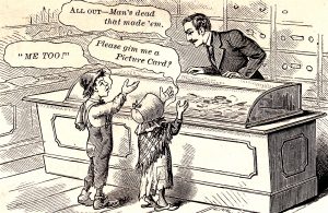
A frustrated 19th Century store clerk tells two pesky children who demand free cards: “All out — Man’s dead that made ’em.”
Antique Advertising Cards
During the late 1800’s, the “fad” of card collecting captured the imagination of a nation. Illustrated business cards that advertised everything from pain cures to farm plows were eagerly snatched up and collected by folks young and old alike. The popularity of these cards changed the way businesses were launched; it shaped the way stores marketed their products; it even impacted the way service providers like dentists and barbers were forced to compete for the loyalty of local clients.
Old Dog… learning New Tricks
Recently, I was updating my ebay listing template for selling Victorian Advertising Trade Cards from my collection via my online store. I noticed my old template said something like: “After 35 years of collecting….”
Three-and-a-half decades suddenly seemed like a lot of years to me, so then I still did some quick finger counting. Well, I had to run the fingers twice, but let’s just say that my template now reads: “After 40 years of collecting…”
I guess I’ve become one of those “old dogs” I used to see on antique row!
As I thought about the old junk shops and flea markets of my youth, and then the emergence of ephemera shows, trade card auctions, the TCCA, and finally, the online trade card market place, it became clear how far the hobby has come.
And how much I miss “the good old days.”
Don’t get me wrong, I like a LOT about the way the Victorian card collecting hobby works today.
But I DO miss the sense of community I used to experience back in the days of face-to-face. Back when almost every new addition to my collection was embedded in a story, often accompanied with a hot or cold beverage, and was always closed with a handshake and a smile.
Dave Cheadle launches Victorian Card HUB Blog and Website to serve the Hobby.
I’ve been thinking about how the Trade Card Collectors Association (TCCA) drew people together, and the excitement of our early national conventions, and even the way we side-by-side plunged our hands into hot water for “Soaking and Salvaging” seminars.
Are those days gone forever?
Who knows?
But as I got to thinking, it dawned on me that, if nothing else, maybe I could launch a website and blog to help generate some new excitement… and some of the old juice from the days when our hobby seemed so “fresh” –even “mind blowing” to those of us on the cutting edge of cataloging and research.
The problem, of course, is that this whole “Social Media” world is all Greek to me.
But I’m willing to give it a try, and to learn on the fly.
Maybe you’ll get a kick out of taking the journey with me?
Let’s see where it goes from here.
Subscribe to this Blog
Feel free to use the “SUBSCRIBE” form on the top right of this page, or send your email address to me if you want to be added to the HUB mailing list. You may also fill out the form on this site’s CONTACT page.
Or just bookmark this page and keep coming back here from time to time to watch things grow!
Good Collecting, and hope to see y’all again sometime soon! – Dave Cheadle
ABOUT the “Old Dog”
— Dave Cheadle began collecting patent medicine advertising cards as a bottle-digging teenager in the 1970’s. He started selling illustrated articles on trade cards to collector magazines in the 1980’s, and he joined forces with Russ Mascieri to form the TCCA in the 1990’s. To date, Dave has published over 150 articles, a definitive price guide and historical reference, and several additional illustrated books about trade cards.