Victorian trade cards were often beautiful, clever, and informative
19th Century consumers gathered these irresistible advertising give-aways from wherever they could find them. And those original Victorian collectors treasured their specimens of 19th Century printing and lithography for good reason.
In an age of mostly black and white photography and line-art publishing, lithographed cards came in breathtakingly vibrant colors.
Advertising cards were informative, and not just about the latest innovations of the industrial age. In addition to educating about new products, these cards incidentally informed about popular culture, teaching people in different regions about new trends and fads from across the country, if not from around the world.
Yes, they were far too fascinating and beautiful to throw away. And even the blandest of these advertising cards were often clever, if not laugh-out-loud comical.
But, oh… the color ones!
Young and old Victorians alike gathered these cards from wherever they could find them: store counters, sales representatives, even packaged inside coffee tins and soap wrappers. Card collections were then sorted, traded with friends, pasted into scrapbooks… even pinned up on the wall or tucked into mirrors and picture frames around the home.
At times, it got competitive, with collectors racing to see who could fill the most albums with the best cards in the shortest amount of time.
In fact, some 19th Century collectors were so aggressive in their collecting they were at times described as down-right “fiendish” in their enthusiasms.
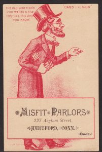
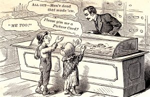
With so much 19th century fascination and energy invested in collecting cards, it is not surprising that a few cards were printed… about cards being printed.
And because a picture is worth a thousand words, let’s see it:
19th Century printing and lithography
as explained and illustrated by cards
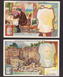
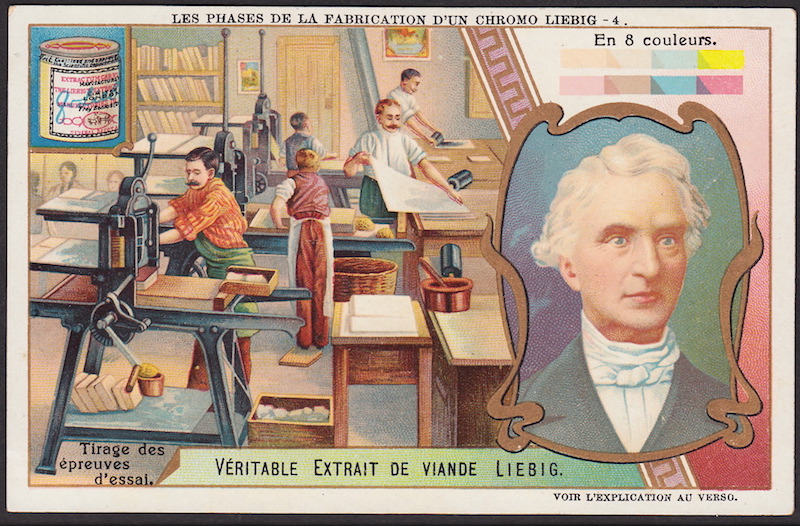
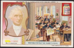
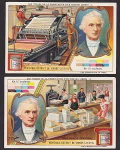
Liebig issued an amazing 6-card set illustrating each of the phases involved in producing a 12-color lithographed card. As chromolithography is explained in these card pictures and captions… the depth of color begins to emerge as inks are applied to Liebig’s portrait!
Of course, some trade cards were inked in as few as one or two colors, and on the other end of the spectrum, Prang Lith. of Boston was known to have inked some prints in 20 colors or more. But this Liebig set illustrates the process very well.
The scenes and captions of the six cards are as follows:
1. The Artist Composes the Subject
/ Portrait – in 2 Colors (L’artiste composent le sujet.)
2. Extraction of the Lithographic Stones
/ Portrait – in 4 Colors (Extraction des pierres lithographiques.)
3. Lithographic Reproduction
/ Portrait – in 6 Colors (La reproduction lithographique.)
4. Creating the Proofs
/ Portrait – in 8 Colors (Tirage des epreuves d’essal.)
5. Final Run. Rotary Press
/ Portrait – in 10 Colors (Tirage definitif. Presse rotative.)
6. Cutting and Packing
/ Portrait – in 12 Colors (Decoupage et emballage.)
Before examining the remaining four of the Liebig cards, it might be helpful to read what one American firm said about the process of color printing.
The production of lithographs was explained in detail on a card issued by
Burdick & Son, lithographers and manufacturers of metal and tin work, Albany, NY.
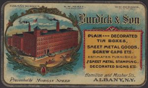
Burdick was noted for, among other things, manufacturing custom tin boxes with beautifully lithographed images. One of the cards they distributed at expositions features a factory view of their Albany, New York, facility. This card is itself a showcase of their work: the card is composed of tin, rather than cardboard.
It is a card designed to demonstrate to potential clients the quality of the 19th Century printing and lithography work they could expect when placing orders for “Decorated Tin Boxes” and lithographed signs, etc.
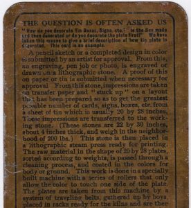
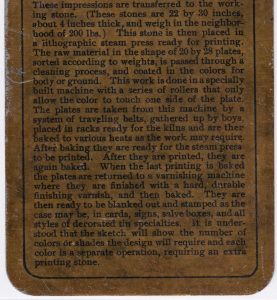
The metal Burdick card describes on back the work that is done with the lithographic stones, the inking process, and other aspects of 19th Century printing and lithography image production.
Back to the Liebig set, which illustrates these steps in 19th Century printing and lithography in brilliant color stages:
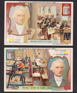
Card 4 of the Liebig set shows printers working with their prepared stone slabs.
Note vertical rows of the stones beneath the presses, with additional stones lined up on distant shelves.
By the final two cards of the Liebig set, the portrait of the company’s founder grows rich and realistic in subtle hues. By the time of the application of the 12th color of ink, the skin is lifelike indeed.
Only one color of ink is applied at each pass through the press, so to get the final portrait image, this card was imprinted 12 times!
And again, each imprint required a distinct stone.
More information about 19th Century printing and lithography will be shared in future posts, but this should give folks a pretty good overview.
A permanent (and expanded) version of this blog post will be posted into the Victorian Card Hub archive.
Visit: 19th Century Printing and Lithography
As always, all the BEST to you, and Good Collecting! — Dave Cheadle